When my inbox lights up with a message from a previous client Im always very excited. This was the case when these clients reached out to inquire about renovating the main floor of their current home. I have previously worked with this family so we had already established a wonderful relationship and since theyd been through the renovation process with me we all knew what to expect.
This project was large and intense with lots of pieces to the puzzle. The entire main floor was being renovated along with the main bathroom and new flooring throughout the entire home. The homeowners were ready for a new primary bedroom but no renovation was required so we added this decorating project.
Establishing a Wishlist
My clients have lived in their home since 2010 so they've had plenty of time to establish what works and what needs to be updated. By the time we met they had a long list of grievances that needed to be addressed.
Updating the Aesthetics
The primary concerns were regarding the outdated aesthetics of the home. Since it hadnt been renovated in more than 15 years it was really looking like a time capsule of design.
Before we moved ahead with the design plans we met to discuss the vision the clients had for their new and improved space. I always encourage clients to do their homework before I arrive. That means spending time on Pinterest or other online decorating sites to establish the style that feels most relevant to themselves. Read this post to learn more about uncovering your own interior design style. After some digging, we established that the design direction was for a more timeless style to be integrated into the space.
Additional Storage
There was also a major concern around the functionality of the kitchen. Like so many homes, the kitchen is the hub and heart of this familys home but it wasnt functioning efficiently. I could immediately see that more storage was required so that went to the top of the wishlist. Learn more about how millwork can elevate your home.
Increasing the Kitchen Size
Aside from the increase of functionality we discussed increasing the size of the kitchen which required moving walls. This is often the most expensive (and scary) part of any renovation because a lot of the homes hidden issues lie behind our homes walls.
I always advise clients who want to remove walls to go slowly. Its important to be flexible about expectations because sometimes surprises mean having to review and reprioritize the previously established wishlist.
New Flooring Throughout
The entire main floor was in need of a flooring update. The homeowners had been living with outdated flooring and were ready for something new. They wanted to ensure that the flooring we selected was timeless and not trendy.
This is such an important distinction when selecting fixed materials in your home, particularly flooring. Fixed materials are those that are long lasting and permanent like flooring, countertops, tiles. Theyre expensive to replace but in the case of flooring its an upset to your entire life. In order to install flooring the home needs to be emptied of furniture and rugs so this is a decision that needs to be made with serious consideration.
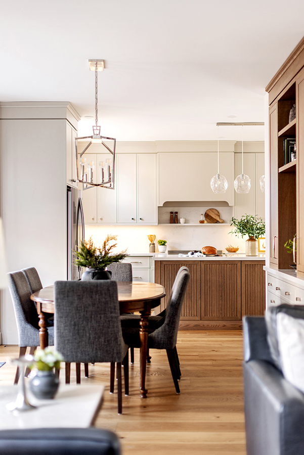
In this case we selected a light oak flooring in a wide plank. We selected this because its absolutely timeless and wont need to be replaced until the homeowners become tired of it.
We also wanted a flooring that would coordinate with the oak cabinetry in the kitchen.
Tackling the Realities of a Budget
Budget constraints are so real and so frustrating for most homeowners. It can be very disheartening to learn that we cant do everything we want, at least in the present time. If youre planning to renovate in the near future just know that its very common to make big and small changes throughout the process. Sometimes things happen that cant be anticipated ahead of time and we need to be able to pivot quickly and move forward.
During the kitchen renovation we had planned to take down two separate walls to increase the kitchen space. While one wall presented no issues we did find the second wall contained the HVAC system and that was going to be a costly and time consuming move to relocate the system.
After lots of number crunching and consideration we decided to leave the second wall intact. It was going to cost too much for the homeowners to feel good about forging ahead. Instead we maximized the space we could include from the removal of just the single wall.
Working With the Budget
Our original design included built-in cabinetry along the long wall of the family room. As so often happens, the budget didnt allow for the full implementation and so we revised the plan to fit with the budget.
Instead of built-ins we opted to go for depth and dimension with wall moulding instead. The homeowners felt the storage from the built-ins wasnt really necessary and the expense could be eliminated. The wall moulding adds so much visual interest to the space and in the end this was a great direction for this space.
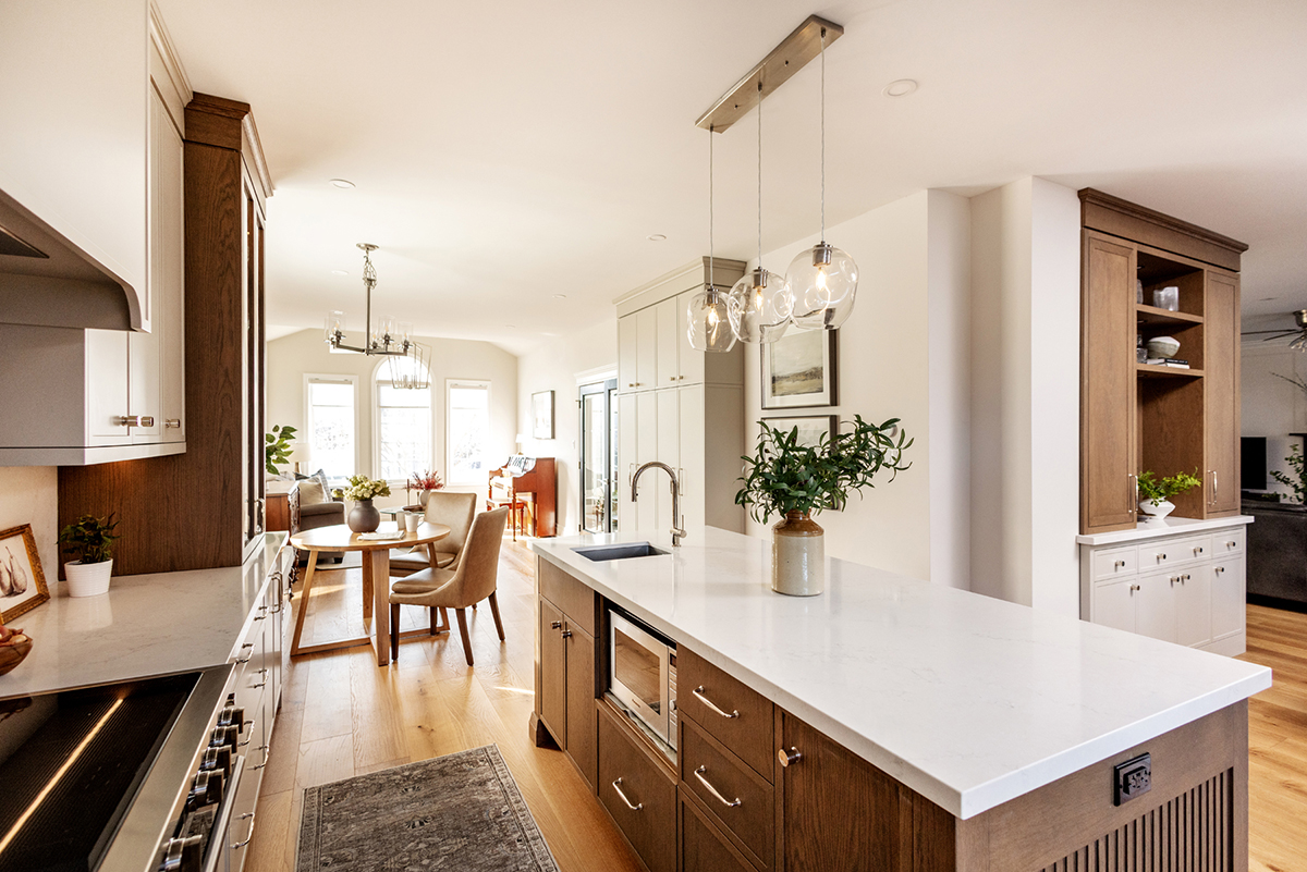
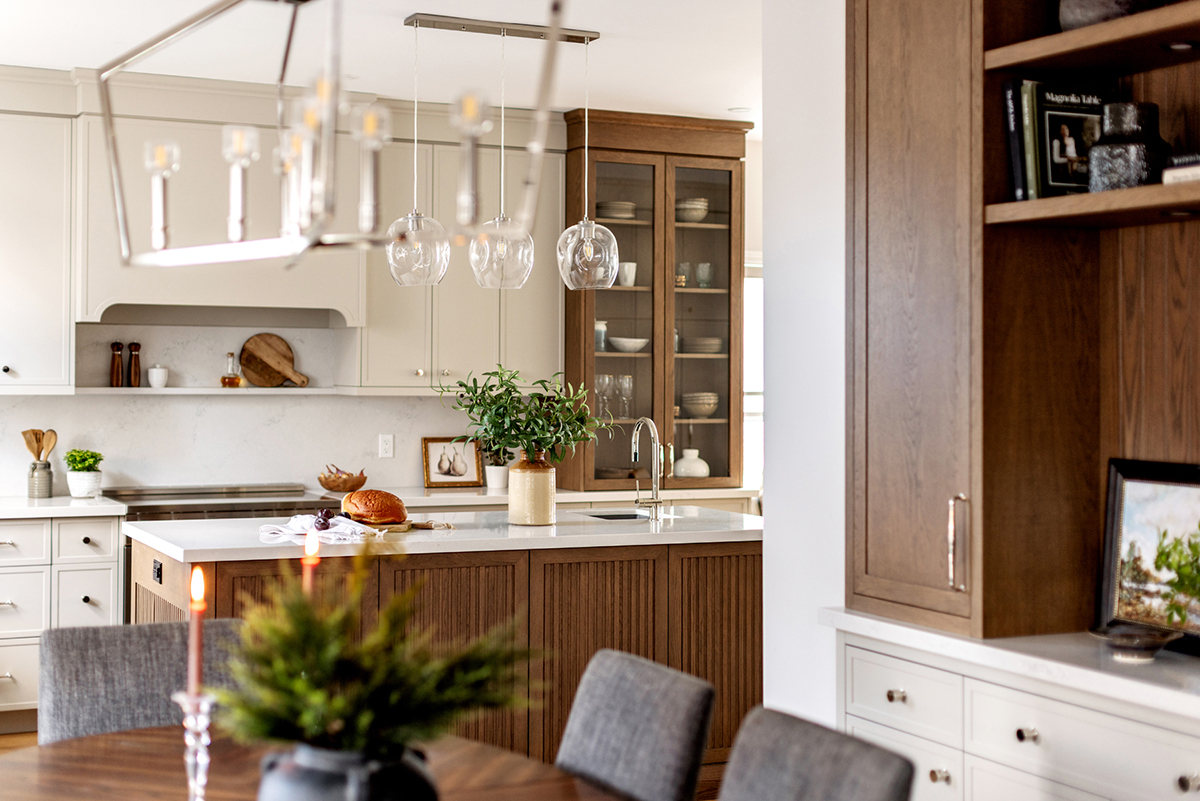
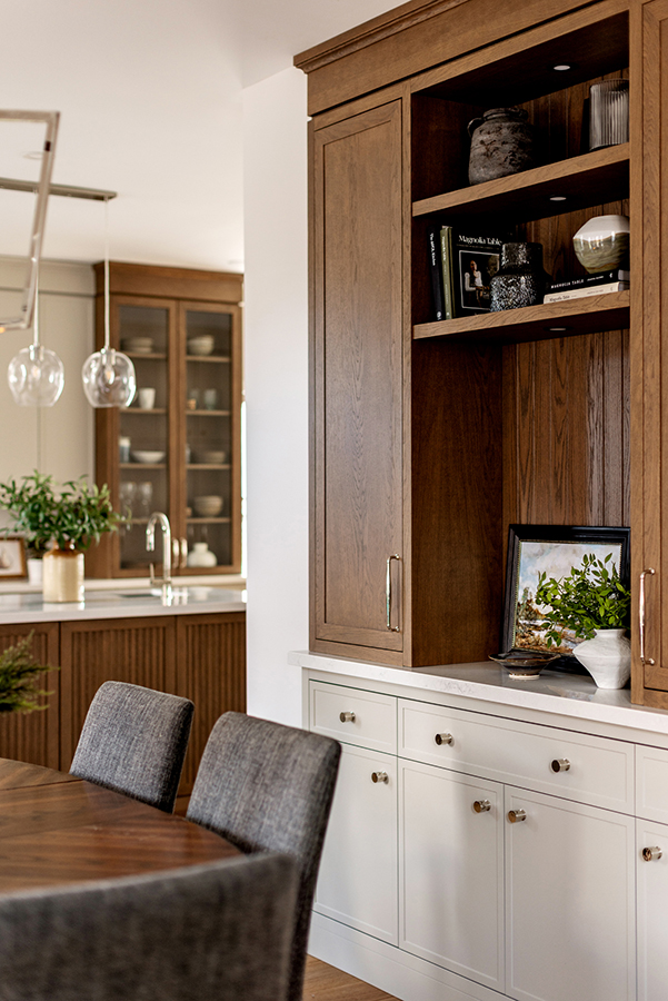
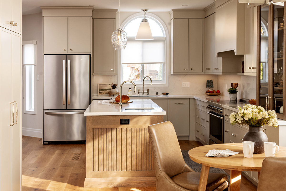
The Completed Kitchen
We set out to design a kitchen that would feel timeless but with a nod to todays trends. The colour palette needed to be classically neutral but we wanted to avoid a drab or boring finished space.
Classic Neutrals
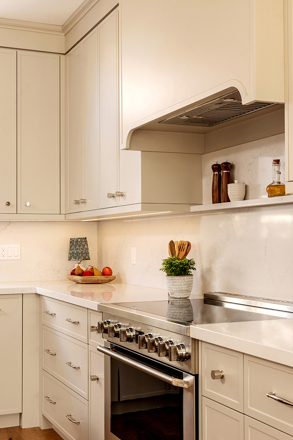
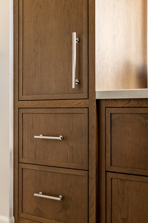
We paired a medium brown stained oak cabinetry with a soft taupe painted cabinet. The combination feels enduring but it somehow also feels fresh and current.
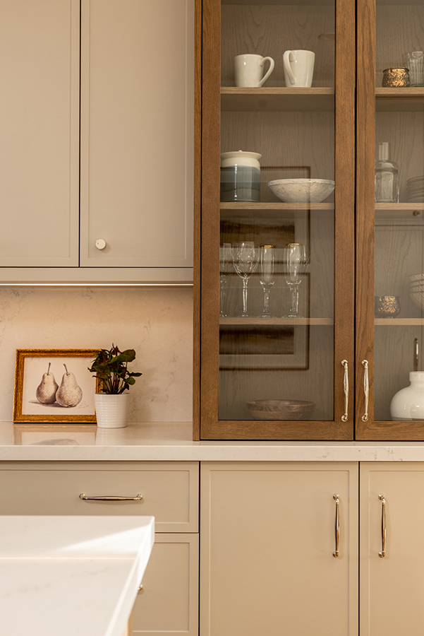
Timeless Countertops & Backsplash
The softly veined quartz countertop was pulled up onto the walls and this helps to establish a feeling of luxury. We tend to associate marble or marble-looking quartz with an ageless space and although this is trending it wont ever date the home.
Light & Airy Cabinetry
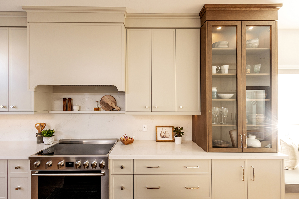
Lastly we opted for a tower of cabinetry with a glass-front cabinet to keep the kitchen feeling light and bright. This is a great tip for any kitchens that dont receive a lot of natural light. Somehow the glass can lighten up a space that might otherwise feel drab.
Nod to the Trends of Today
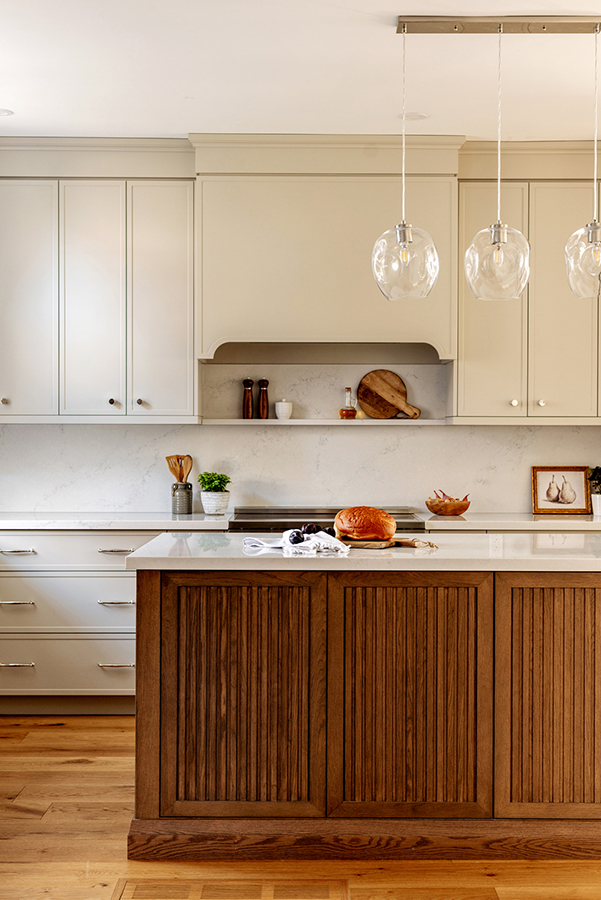
I wanted to incorporate just a hint of todays trends just to keep the space from feeling too stuffy. We incorporated a fluted design into the doors of the island which gives us a fresh and interesting aesthetic. When designing a timeless space, always maintain classic materials and incorporate the trends in a small but significant way.
We also added a cutout arch to the stove vent cover for another nod to the current trends. This is a nice addition because while its trending it wont ever look dated or in need of replacement. Its just a subtle but interesting shape that adds dimension to the kitchen.
Utilizing Every Inch
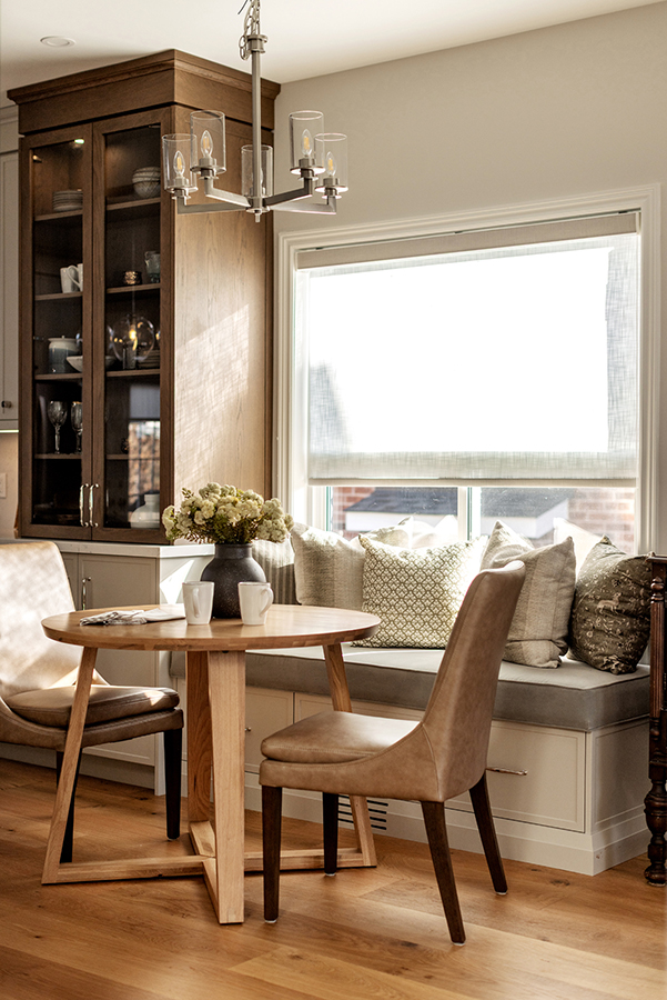
The best design incorporates every inch of space and that was our primary goal in this kitchen. Since this kitchen isnt huge we wanted to ensure that we maximized the space to function as effectively as possible.
We love window seating and this bright little area was just prime for creating a small eating nook. We extended the cabinetry across the front of the window, added a custom bench seat and added a small table and chairs.
This is an easy way to add additional seating but it also elevates your space without a huge expense. It looks like you hired a designer but its something that an industrious homeowner can add on their own with just some limited skills.
The Completed Bathroom
The main bathroom in this home hadnt been updated for a long time and was definitely in need of an updated appearance. Read this post and learn what to incorporate and what to avoid in your bathroom renovation.
Dramatic Tiles
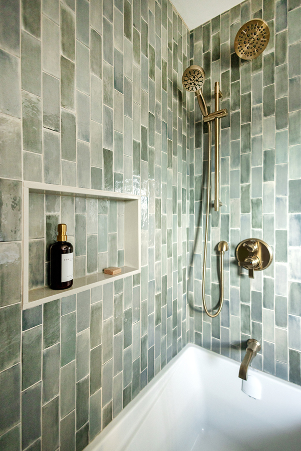
Since this is a small bathroom its easy to create drama with the addition of a single element. In this case we wanted the shower tile to be the show stopper of the space. The watery greens evoke a calm and relaxing spa feel. We opted to stack the tile vertically for a clean and modern take on the subway tile.
Classic Materials
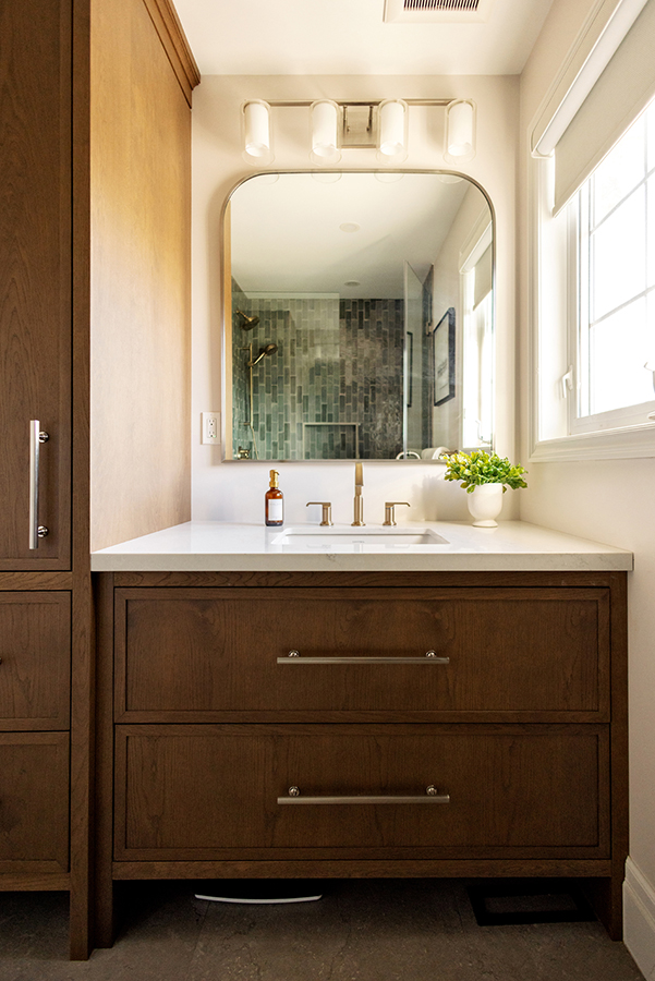
We didnt want to create conflicting focal points so while we were happy to let the subway tile steal the attention we also wanted to ensure that the rest of the materials were timeless and classic.
We used the same beautiful oak cabinetry in a medium brown stain that we used in the kitchen. Theres no need to change the wood or stain when designing your own home but instead, create a consistent palette throughout by maintaining materials in different spaces. We also incorporated the same quartz in the bathroom that was used in the kitchen.
Outstanding Accents
Just like with jewelry on a little black dress, the hardware in a bathroom should highlight and emphasize the design rather than trying to steal the show. I chose to incorporate mixed metals into this space as a way to create some understated drama.
The shower is equipped with gold hardware that matches the sink faucet and handles while the cabinetry hardware is a matte nickel. I encourage you to try something new by mixing your metals even in a small space. The effect is interesting and creates a feeling of luxury but in a very understated way.
The Completed Laundry Room
There was a time when a laundry room was an afterthought but not any longer. Were putting much more design effort into these small but mighty spaces.
A Punch of Colour
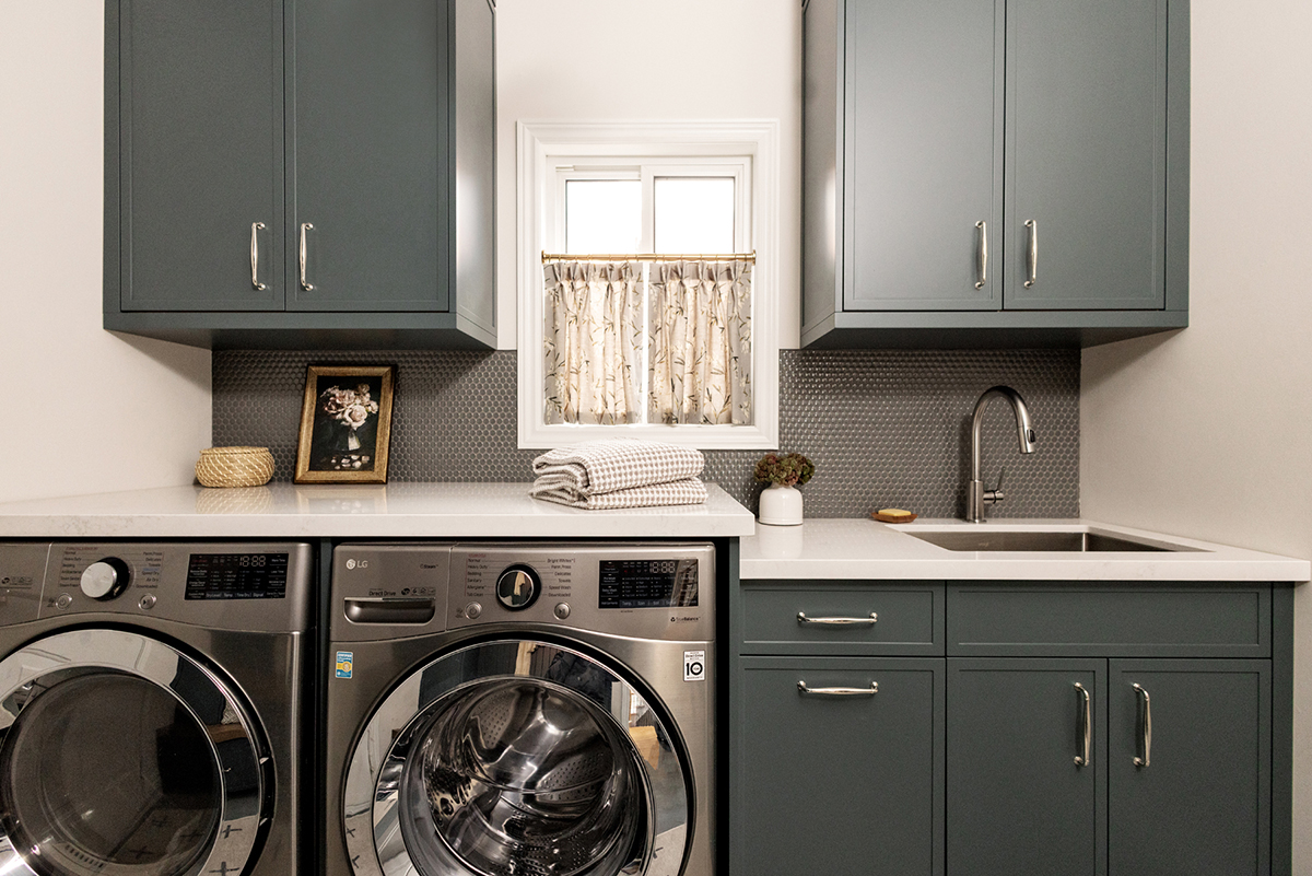
Even the most neutral colour lover might be convinced to add some dramatic colour to their laundry room. Its a space thats not often visited by guests and it likely has a door that will remain closed when not in use. So why not be bold and make those cleaning sessions a bit more fun with an unexpected colour.
In this case, we couldnt resist this deep and dramatic green and the risk paid off because this is a cocoon of colour that feels warm and inviting. Theres nothing cold or sterile at all so always go for a bit of dramatic fun in your laundry room.
Coordinating Tiles
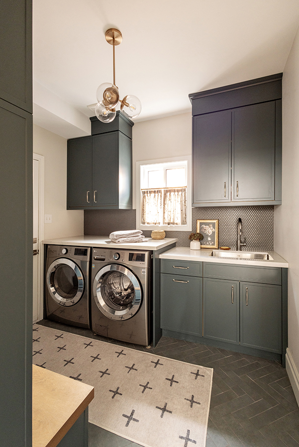
Since this space is an entry from the outside we wanted to use a floor tile that felt like the perfect balance between outdoors and indoors.
This subway tile in deep green is set in a herringbone pattern which definitely elevates it beyond any ordinary tile. The colour of this gorgeous tile was the jumping off point for the entire room. The cabinetry colour, along with the backsplash was selected to coordinate with the floor tile.
We went for a penny tile backsplash to coordinate with the flooring but also to give the space a bit of sparkle and brightness. Laundry rooms are definitely utilitarian but theres no reason they have to be drab or boring.
Storage Needs Fulfilled
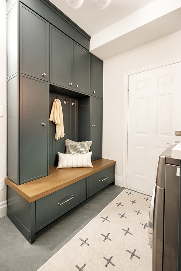
One of the biggest complaints I hear from homeowners wanting to renovate is that they need more storage. Such was the case for this family who needed more space to hang outdoor items and store seasonal items.
Instead of just a few hooks on the wall to catch the snowy or rainy coats, we opted to have a storage solution created and installed. This space is often left unused in a laundry room but we decided this millwork project would add the storage they needed and make a strong aesthetic statement. The laundry room looks like an intentional part of the home as opposed to the unloved space thats often neglected.
The Bedroom of Good Dreams
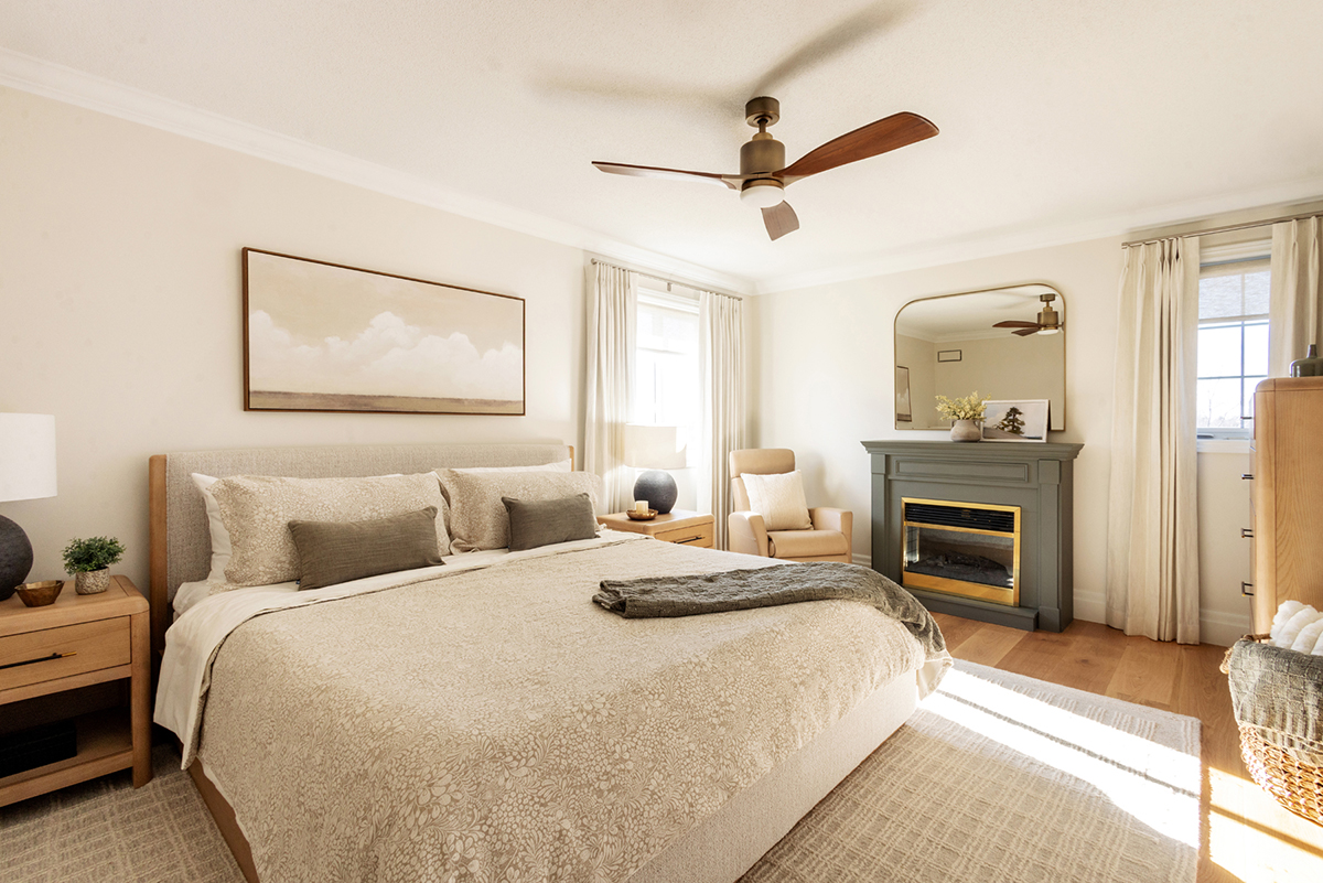
This space was not in need of a structural renovation but it did require an update. The fireplace was original to the room but we gave it an upgrade by painting it in a lovely olive green.
The furniture, rug and all accessories are brand new but they all look like they were built for this space. And the most beautiful custom curtains finish off this room in an elevated way by adding timeless elegance to the space.
The Final Verdict
This home ended up more perfect than we had hoped for. We met the criteria of creating a timeless but updated space that feels warm and inviting.
My clients are thrilled with the new kitchen and their time spent cooking and baking is now more cherished than before. They love spending time together as a family but also entertaining and showing off the new space.
My favourite is a real toss up between the kitchen and the laundry room. Both of these spaces feel very sophisticated and I love the timeless nature of both rooms.
If you have a project youre undertaking in 2026 be sure to reach out to me. Id love to discuss how Kristina Gray Design can help you as a design partner in your journey.