At the beginning of every year we see a colour revealed by each of the paint manufacturers which represents their colour of the year. This trend usually reveals not just the colour but also follows the mood of the world. For example, after the pandemic we saw the majority of manufacturers offer a version of green to exemplify our need to be reconnected to nature.
This year its all about muted colours in warm, earthy tones as well as warm neutrals. As you can see from the image below, this years winners are all muted and understated. Theres a variety of tones but they all feel warm and grounded. Its a reconnection to nature which is said to be a reflection and a desire for calmness and authenticity. Heres what youll be seeing on walls everywhere in 2026.
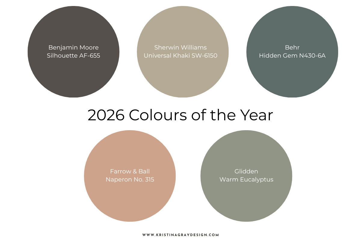
Paint Colours Were Loving in 2026
Here are the colours that we at Kristina Gray Design feel youll be seeing lots of throughout this year.
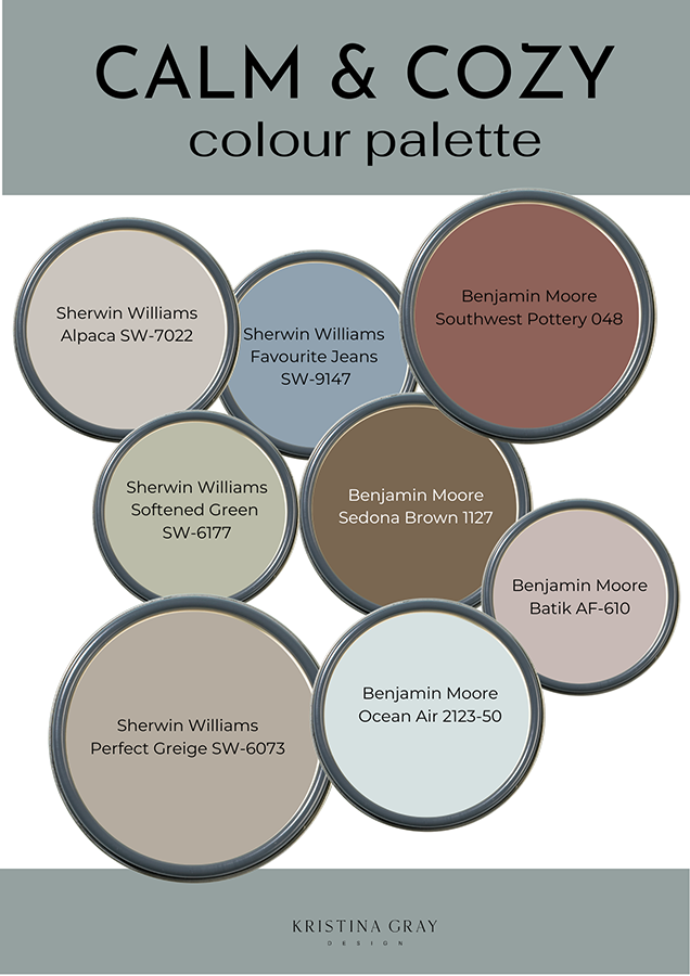
Do you notice anything when you look at this palette all together? The first thing I notice is the muted and understated feel of these colours. Even those that are highly saturated and would be considered bold or strong have a calm and serene effect because theyre muted.
1/ Sherwin Williams Alpaca SW-7022
This is a go-to neutral for those who want something warm but without adding too much colour. This is a greige which means its composed of both beige and gray. Alpaca has strong brown undertones which keeps it feeling warm rather than allowing the gray to dominate with cooler tones.
Where to Use Alpaca
This is a colour that can be used anywhere in your home. It would be an ideal colour for an open concept space where you want a single colour to work its way through the house. Its also ideal for cabinetry so use it in both kitchens and bathrooms.
Perfect Trim Colour for Alpaca
This colour shines when paired with a crisp white. I recommend Sherwin Williams High Reflective White SW-7757. If you want something bolder I would pair this with a chocolate brown for a dramatic effect. Use something deep and dramatic like Dark Clove SW-9183.
2/ Sherwin Williams Favourite Jeans SW-9147
This gorgeous blue is a medium-toned, muted blue with subtle gray undertones that evoke the feeling of a comfortable, well-worn pair of denim. While blue can sometimes feel really cool this muted blue has a warmth that comes from the warm undertones.
Where to Use Favourite Jeans
I love this colour for a bedroom regardless of age. This would be as gorgeous in a nursery as in a primary bedroom because its just a timeless blue. I also love this shade for an elegant bathroom and this would pair beautifully with black and white tile.
Perfect Trim for Favourite Jeans
Is there a better combination than white and blue? I dont think so and Im choosing a soft, warm white to pair with this warm blue. Sherwin Williams Alabaster SW-7008 or Extra White SW-7005 are the perfect selections for Favourite Jeans.
3/ Benjamin Moore Southwest Pottery 048
This gorgeous hue captures the feeling of sundrenched earth or adobe homes of Santa Fe. If youre old enough to remember the Santa Fe design trend that captured many of us in the 1980s youll see the similarities. That design style was characterized by muted desert pastels and earthy tones just like Southwest Pottery. This colour is a combination of red, brown and orange hues that combine into a gorgeous and liveable colour.
Where to Use Southwest Pottery
Since this is such a distinct and bold colour Id be selective about where to use it in your home. I prefer colours like this to be highlighted in small rooms like powder rooms or laundry rooms as opposed to the walls of a main room. I would also use this as a bold option for millwork or cabinetry.
Perfect Trim for Southwest Pottery
I think a pure white would be too stark for this colour and instead, Id prefer to see something warm to match the warmth of Southwest Pottery. Benjamin Moores Swiss Coffee is a perfect selection because itll give you a warmer and more cohesive feeling.
4/ Sherwin Williams Softened Green SW-6177
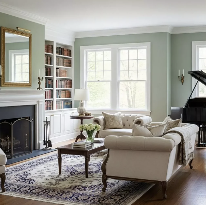
If you think sage green is out, think again. This gorgeous colour is a light to medium green that relies on the gray undertones to keep it from feeling too bright. Instead, its a perfect green with a calm, sophisticated, and organic feel.
Where to Use Softened Green
This colour will work in just about any room in your home because its so soft and easy to live with. According to the psychology of colour, green evokes feelings of calm, renewal and harmony. I think that makes it a perfect colour for a space you go to when you want to unwind. Bedrooms, family rooms or an office are perfect spaces to test out of this gorgeous green.
Perfect Trim for Softened Green
This colour is so soft and warm but I think it will be best when paired with a crisp white. This will allow both the green and the white to stand out and together they make a great combination. Try Sherwin Williams Pure White or Extra White for a classic combo.
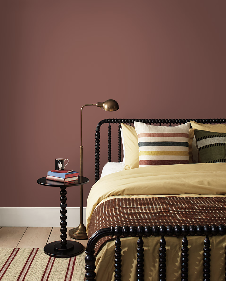
5/ Benjamin Moore Sedona Brown 1127
If you love brown youre going to be thrilled to hear that all shades of brown are going to be popular in 2026. This lovely shade in particular is kept bright due to the inclusion of orange and thats what prevents it from feeling too dark. This is such a warm colour and one that will help to create a cozy and warm space in your home.
Where to Use Sedona Brown
This is the perfect colour for any space in your home where you want to feel embraced. It can create a cocoon particularly if you wrap the colour onto the ceiling as well. I would use this in any room with the exception of a basement or any other space that doesnt receive much natural light. It may feel too dull without some natural light flowing through the room.
Perfect Trim for Sedona Brown
This colour works well with so many other colours so youre really not limited. For a classic look go with a timeless white like Benjamin Moores Simply White. If you want to create a more contemporary space use a soft taupe like Benjamin Moores Edgecomb Gray. For those that want to go all out you can try a khaki green like Benjamin Moores Coastal Fog.
6/ Benjamin Moore Batik AF-610
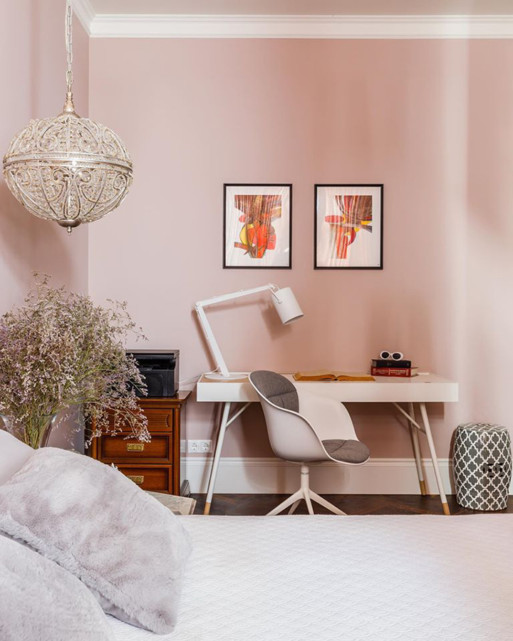
Violet and rose have never looked so good. This colour has soft taupe undertones of both gray and subtle brown. This allows it to appear warm or cool depending on the lighting conditions. This is a really versatile neutral and will look both amazing and unexpected so if you want to be ahead of the curve give this a try.
Where to Use Batik
This leans towards the more feminine but I believe it would be a gorgeous colour in any space in your home. The most obvious suggestion is likely a bedroom but why stop there? This colour works for living and dining spaces and would be absolutely stunning as a cabinetry colour for the daring souls amongst us.
Perfect Trim for Batik
I think this colour could incorporate both warm and cool whites as a trim colour but I personally would lean towards the warm. I like a tiny bit of warmth in a trim colour thats paired with a softer pastel like this one.
7/ Sherwin Williams Perfect Greige SW-6073
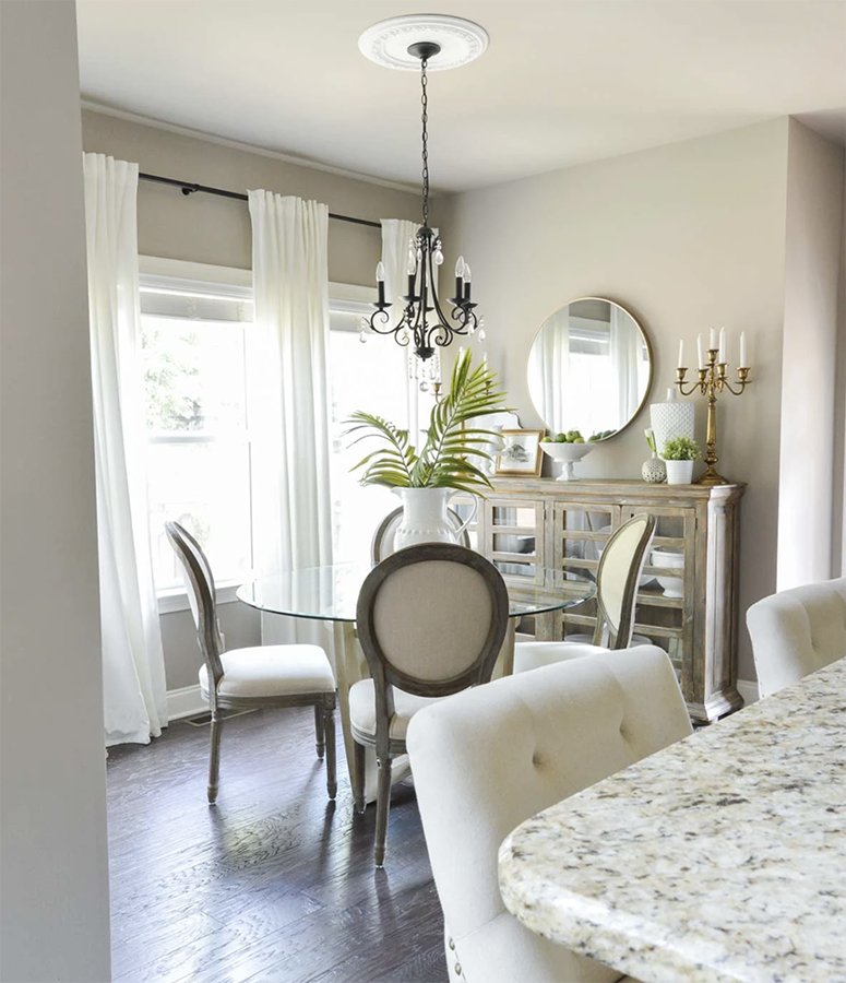
This aptly named colour is a very popular choice with those that love a good neutral. This one is mid-toned so it wont feel like some of the barely there neutrals but instead, it feels like a colour. This colour has pink and red undertones which keeps it feeling warm and cozy.
Where to Use Perfect Greige
I cant think of a single room that wouldnt look great with this colour. For those who just dont love colour this could be for you. Use it everywhere including millwork, trim and cabinetry.
Perfect Trim for Perfect Greige
Since this colour is so warm I recommend pairing it with a warm white like Sherwin Williams Alabaster. If you prefer the strong contrast in your trim you can go for a more traditional white like Sherwin Williams Pure White.
8/ Benjamin Moore Ocean Air 2123-50
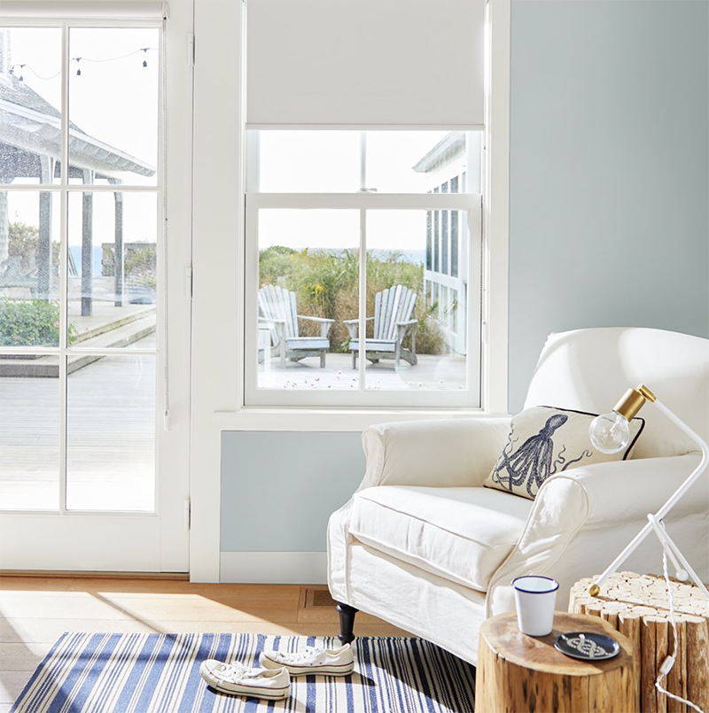
If youre looking for a colour that will instantly create a calm and tranquil space, this is for you. This is a very soft blue that has hints of green but is kept muted because of the gray undertones. It does tend to lean more cool so its better used in a room with lots of natural light to keep it from feeling cold.
Where to Use Ocean Air
This colour evokes the feeling of water and sky so its perfect for spaces where you want to relax. I love this colour for bathrooms and bedrooms but really its a good colour for any room in your home.
Perfect Trim for Ocean Air
I like to use warmer whites with this cooler toned blue. A cool white may leave you feeling uncomfortable in your space. Instead, opt for something warm like Benjamin Moores OG Cloud White. This will warm up the blue and create harmony in your home.
If youre feeling overwhelmed trying to select paint colours on your own and need some help, reach out. Wed love to help take the aggravation out of selecting the perfect colours for your home.